Form Configuration
This page will explain how to configure the inputs into a form of a CRUD feature with BIA Framework.
Form fields
Principles
All the fields that must be displayed in your CRUD feature must be declared in a BiaFieldsConfig<TDto> class, where TDto represents your feature model. This class is used both for the form and the table display of your feature CRUD screens.
The declaration must be set in your feature model, exported as const, and associated to the feature CrudConfig in your feature's constants declarations :
export const featureCRUDConfiguration: CrudConfig<Feature> = new CrudConfig({
  featureName: 'features',
  // Here, featureFieldsConfiguration is declared as const into the feature model
  fieldsConfig: featureFieldsConfiguration
  [...]
});
The declaration in the model and association in the constants are already set when using CRUD generation from BIAToolkit.
Configuration
You must add all your fields to display in the columns property of the BiaFieldsConfig<TDto>.
Each column item must be a BiaFieldConfig<TDto>, where you will configure for each field :
field: feature's property name to bind with (mandatory in constructor)header: header name of your feature's property when displayed into a table (mandatory in constructor)type: type of the input (Date|DateTime|Time|TimeOnly|TimeSecOnly|Number|Boolean|String|OneToMany|ManyToMany)filterMode: filter mode when displayed into a tableisSearchable: searchable mode (true|false)isSortable: sortable mode (true|false)icon: icon displayed beside the header name when displayed into a tablefieldEditMode: edit mode of the field in forms (FieldEditMode.Editable|FieldEditMode.ReadOnly|FieldEditMode.InitializableOnly|FieldEditMode.UpdatableOnly)isEditableChoice: editable choice mode (true|false)isVisible: visibility mode into form (true|false)tableColumnVisibility: visibility mode in the table (TableColumnVisibility.Visible|TableColumnVisibility.AvailableButHidden|TableColumnVisibility.Hidden)maxlength: maximum length setting when input is a stringisRequired: required mode (true|false)validators: set of validators to apply to the inputminWidth: minimum width when displayed into a tableisFrozen: frozen mode into the table (true|false)alignFrozen: frozen alignement in the table (right|left)displayFormat: display format for numbers or date by providing the requiredBiaFieldNumberFormatorBiaFieldDateFormatspecificOutput: specific output mode (true|false) (see next chapter)specificInput: specific input mode (true|false) (see next chapter)
Example :
export const featureFieldsConfiguration: BiaFieldsConfig<Feature> = {
  columns: [
    // Field configuration for msn property
    Object.assign(new BiaFieldConfig('msn', 'feature.msn'), {
      isRequired: true,
      validators: [Validators.maxLength(64)],
    }),
    // Field configuration for manufacturer property
    Object.assign(new BiaFieldConfig('manufacturer', 'feature.manufacturer'), {}),
    // Field configuration for isActive property
    Object.assign(new BiaFieldConfig('isActive', 'feature.isActive'), {
      isRequired: true,
      isSearchable: true,
      isSortable: false,
      type: PropType.Boolean,
    }),
    // Field configuration for estimatedPrice property
    Object.assign(new BiaFieldConfig('estimatedPrice', 'plane.estimatedPrice'), {
      type: PropType.Number,
      filterMode: PrimeNGFiltering.Equals,
      displayFormat: Object.assign(new BiaFieldNumberFormat(), {
        mode: NumberMode.Currency,
        minFractionDigits: 2,
        maxFractionDigits: 2,
        currency: 'EUR',
      }),
      validators: [Validators.min(0)],
    }),
    [...]
  ]}
No need to set a required Validator if you have set the property isRequired to true
Specific input/output
You can set your field as specific input and/or output into your form or your table to customize the display and setting of your field's value :
- set
specificInputtotrueinto your BIA forms and BIA table using calc mode - set
specificOutputtotrueinto your BIA tables
To use them, you must define a template for your specificInput or specificOutput into the form or the table :
<bia-calc-table>
  <ng-template pTemplate="specificInput" let-field="field" let-form="form">
    <span [formGroup]="form">
      <ng-container [ngSwitch]="field.field">
        <ng-container *ngSwitchCase="'myField'">
          <!-- Apply here your template for your field  -->
          <p-checkbox binary="true" [formControlName]="field.field"></p-checkbox>
        </ng-container>
      </ng-container>
    </span>
  </ng-template>

  <ng-template pTemplate="specificOutput" let-field="field" let-data="data">
    <ng-container [ngSwitch]="field.field">
      <ng-container *ngSwitchCase="'myField'">
        <!-- Apply here your template for your field  -->
        <i class="pi pi-circle-fill" [ngClass]="{ 'red-circle': !data, 'green-circle': !!data }"></i>
      </ng-container>
    </ng-container>
  </ng-template>
</bia-calc-table>
Form layout
Principles
Hierarchy
The class BiaFormLayoutConfig<TDto> is the container of your form layout configuration. Each items of this class (BiaFormLayoutConfigItem) will represent a configuration to customize the disposition of your inputs into the form, where TDto represents your feature model.
These BiaFormLayoutConfigItem can be :
BiaFormLayoutConfigRow<TDto>: a row that will contain a set ofBiaFormLayoutConfigColumn<TDto>BiaFormLayoutConfigGroup<TDto>: a group ofBiaFormLayoutConfigRow<TDto>under a title (title must refer to a translatable resource)BiaFormLayoutConfigTabGroup<TDto>: a set ofBiaFormLayoutConfigTab<TDto>that each contains otherBiaFormLayoutConfigItem
// Config
new BiaFormLayoutConfig<Feature>([
  // First row
  new BiaFormLayoutConfigRow([]),
  // Second row, wich is a group
  new BiaFormLayoutConfigGroup('feature.groupTitle', [
    // First row of the group
    new BiaFormLayoutConfigRow([]),
    // Second row of the group
    new BiaFormLayoutConfigRow([]),
  ]),
  // Third row, which is a tab
  new BiaFormLayoutConfigTabGroup([
    // First tab
    new BiaFormLayoutConfigTab([
      new BiaFormLayoutConfigRow([]),
    ]),
    // Second tab
    new BiaFormLayoutConfigTab([
      new BiaFormLayoutConfigRow([]),
    ]),
  ])
])
A BiaFormLayoutConfigColumn<TDto> element can be :
BiaFormLayoutConfigField<TDto>which represents a field of one of your feature's propertyBiaFormLayoutConfigGroup<TDto>so you can set in a column a new group of fieldsBiaFormLayoutConfigTabGroup<TDto>to set a new tab group into your column
// Config
new BiaFormLayoutConfig<Feature>([
  // First row
  new BiaFormLayoutConfigRow([
    // First column, which is a field
    new BiaFormLayoutConfigField('field1'),
    // Second column, which is a group
    new BiaFormLayoutConfigGroup('feature.groupTitle', [
      // First row of the group
      new BiaFormLayoutConfigRow([
        // First column, which is a field
        new BiaFormLayoutConfigField('field2')
        // Second column, which is a field
        new BiaFormLayoutConfigField('field3')
      ]),
    ]),
    // Third column, which is a tab
    new BiaFormLayoutConfigTabGroup([
      // First tab
      new BiaFormLayoutConfigTab([
        new BiaFormLayoutConfigRow([
          // First column of the tab, which is a field
          new BiaFormLayoutConfigField('field4')
          // Second column of the tab, which is a field
          new BiaFormLayoutConfigField('field5')
        ]),
      ]),
      // Second tab
      new BiaFormLayoutConfigTab([
        new BiaFormLayoutConfigRow([
          // First column of the tab, which is a field
          new BiaFormLayoutConfigField('field6')
          // Second column of the tab, which is a field
          new BiaFormLayoutConfigField('field7')
        ]),
      ]),
    ])
  ]),
])
All the fields used in the BiaFormLayoutConfig must have been declared in the BiaFieldsConfig of your CRUD feature.
Responsive design
When declaring a BiaFormLayoutConfigColumn<TDto> element, you can set the column size by :
-
setting only the
lgSizewhich represents the column size for large screen (>= 992px) :new BiaFormLayoutConfigGroup<Feature>('Group', groupRows, 2)new BiaFormLayoutConfigField<Feature>('field', 2)The
lgSizemust be set between 1 and 12 to be valid.
The mobile first column size (< 576px) will be always 12.The
lg,mdandsmsizes will be automatically calculated according to the following rules:sm(>= 576px) is always 12lg(>= 992px) is computed asfloor(remainingSize / autoSizedColumns), whereremainingSize = 12 - sum of explicit lgSizesandautoSizedColumnsis the number of columns without an explicit sizemd(>= 768px) is computed assnapToGrid(ceil(12 / colsInRow)), wherecolsInRowis the total number of columns in the row andsnapToGridrounds up to the nearest value in[1, 2, 3, 4, 6, 12]
For a row with a single column (
colsInRow = 1), bothmdandsmwill always be 12.For rows with multiple columns, the
mdsize is snapped to the grid based on the number of columns. Examples:colsInRow lg (>= 992px) md (>= 768px) sm (>= 576px) 1 12 12 12 2 6 6 12 3 4 4 12 4 3 3 12 5 2 3 12 6 2 2 12 12 1 1 12 -
setting all the size breakpoints (
lg,md,smandmobileFirst) inside aBiaFormLayoutConfigColumnSizeclass :new BiaFormLayoutConfigGroup<Feature>('Group', groupRows, new BiaFormLayoutConfigColumnSize(6, 6, 6, 6))new BiaFormLayoutConfigField<Feature>('field', new BiaFormLayoutConfigColumnSize(6, 6, 6, 6))
If you don't specify the column size, the parent BiaFormLayoutConfigRow<TDto> will compute the ideal column size depending both on the remaining column size left by the columns with a custom size, and the total column count in the row.
Configuration
- In front-end, open the model of your feature
- Complete or add the
BiaFormLayoutConfig<TDto>definition with your form configuration - Add the groups, rows and columns by required order of display
Size Configuration Examples
Below is a real-world example using a Plane feature, covering the main use cases for column size configuration.
export const planeFormLayoutConfiguration: BiaFormLayoutConfig<Plane> =
  new BiaFormLayoutConfig([
    // Row with two groups side by side (auto-sized columns)
    new BiaFormLayoutConfigRow([
      new BiaFormLayoutConfigGroup('plane.groupIdentification', [
        // 2 auto-sized fields → lg:6, md:6, sm:12 each
        new BiaFormLayoutConfigRow([
          new BiaFormLayoutConfigField('msn'),
          new BiaFormLayoutConfigField('manufacturer'),
        ]),
      ]),
      new BiaFormLayoutConfigGroup('plane.groupStatus', [
        // 2 auto-sized fields → lg:6, md:6, sm:12 each
        new BiaFormLayoutConfigRow([
          new BiaFormLayoutConfigField('isActive'),
          new BiaFormLayoutConfigField('isMaintenance'),
        ]),
      ]),
    ]),

    // Group with two rows
    new BiaFormLayoutConfigGroup('plane.groupTracking', [
      // 4 auto-sized fields → lg:3, md:3, sm:12 each
      new BiaFormLayoutConfigRow([
        new BiaFormLayoutConfigField('deliveryDate'),
        new BiaFormLayoutConfigField('firstFlightDate'),
        new BiaFormLayoutConfigField('lastFlightDate'),
        new BiaFormLayoutConfigField('nextMaintenanceDate'),
      ]),
      // 2 auto-sized fields → lg:6, md:6, sm:12 each
      new BiaFormLayoutConfigRow([
        new BiaFormLayoutConfigField('syncFlightDataTime'),
        new BiaFormLayoutConfigField('syncTime'),
      ]),
    ]),

    // Single field with explicit size: half-width on lg/md, full-width on sm/mobile
    new BiaFormLayoutConfigRow([
      new BiaFormLayoutConfigField('motorsCount',
        new BiaFormLayoutConfigColumnSize(6, 6, 12, 12)),
    ]),

    // 3 auto-sized fields → lg:4, md:4, sm:12 each
    new BiaFormLayoutConfigRow([
      new BiaFormLayoutConfigField('probability'),
      new BiaFormLayoutConfigField('capacity'),
      new BiaFormLayoutConfigField('totalFlightHours'),
    ]),

    // Mixed explicit sizes in the same row:
    // fuelCapacity takes 4/12 on lg, originalPrice takes 8/12 on lg
    new BiaFormLayoutConfigRow([
      new BiaFormLayoutConfigField('fuelCapacity',
        new BiaFormLayoutConfigColumnSize(4, 6, 12, 12)),
      new BiaFormLayoutConfigField('originalPrice',
        new BiaFormLayoutConfigColumnSize(8, 12, 12, 12)),
    ]),

    // Fine-grained control: non-standard breakpoints for all sizes
    // fuelLevel is narrow (3/12) on lg/md/sm, half on mobile
    // estimatedPrice fills the rest (9/12) on lg/md/sm, full on mobile
    new BiaFormLayoutConfigRow([
      new BiaFormLayoutConfigField('fuelLevel',
        new BiaFormLayoutConfigColumnSize(3, 3, 3, 6)),
      new BiaFormLayoutConfigField('estimatedPrice',
        new BiaFormLayoutConfigColumnSize(9, 9, 9, 12)),
    ]),
  ]);
The framework will automatically generate the form like this :
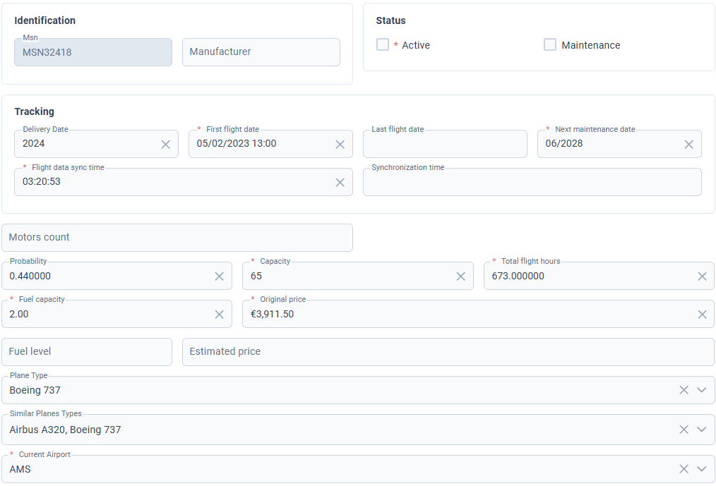
All the remaining fields declared in the BiaFieldsConfig will be displayed after the fields handled in the BiaFormLayoutConfig.
Use cases explained
Auto-sized columns — omit the size argument and let the row distribute the space evenly:
// 2 fields in a row → each gets lg:6, md:6, sm:12
new BiaFormLayoutConfigRow([
  new BiaFormLayoutConfigField('msn'),
  new BiaFormLayoutConfigField('manufacturer'),
])
Single explicit lgSize — pass a number to control the large-screen width; md and sm are derived automatically:
// lg:2 → md: snapToGrid(ceil(12/1)) = 12, sm:12
new BiaFormLayoutConfigField('msn', 2)
Full explicit size with BiaFormLayoutConfigColumnSize(lg, md, sm, mobileFirst) — use when you need precise control at every breakpoint:
// Half-width on lg and md, full-width on sm and mobile
new BiaFormLayoutConfigField('motorsCount',
  new BiaFormLayoutConfigColumnSize(6, 6, 12, 12))
Mixed explicit sizes in a row — fields share the 12-column grid; sizes must add up to 12 for a clean layout:
// fuelCapacity: 4/12 on lg | originalPrice: 8/12 on lg
new BiaFormLayoutConfigRow([
  new BiaFormLayoutConfigField('fuelCapacity',
    new BiaFormLayoutConfigColumnSize(4, 6, 12, 12)),
  new BiaFormLayoutConfigField('originalPrice',
    new BiaFormLayoutConfigColumnSize(8, 12, 12, 12)),
])
Non-standard breakpoints — useful when the default snapping doesn't match your design:
// Narrow label (3/12) next to a wide value (9/12) at all breakpoints
new BiaFormLayoutConfigRow([
  new BiaFormLayoutConfigField('fuelLevel',
    new BiaFormLayoutConfigColumnSize(3, 3, 3, 6)),
  new BiaFormLayoutConfigField('estimatedPrice',
    new BiaFormLayoutConfigColumnSize(9, 9, 9, 12)),
])
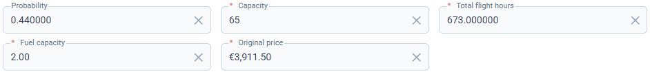
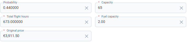
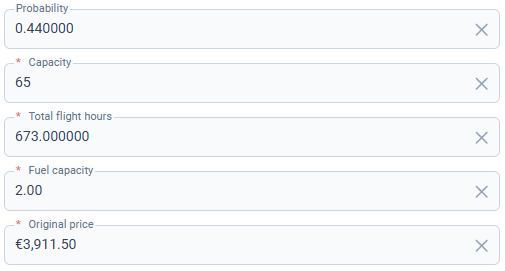
Intentional overflow to control wrapping across breakpoints — when you have more fields than fit in one row at smaller screen sizes, you can use explicit sizes to control how many fields appear per row at each breakpoint. Fields that exceed 12 columns wrap to the next line automatically:
// 5 fields × col-3 = 15 on lg → wraps: 4 fields on first line, 1 on second
// 5 fields × col-4 = 20 on md → wraps: 3 fields per line
// 5 fields × col-6 = 30 on sm → wraps: 2 fields per line
// 5 fields × col-12 = 60 on mobile → 1 field per line
new BiaFormLayoutConfigRow([
  new BiaFormLayoutConfigField('probability',
    new BiaFormLayoutConfigColumnSize(3, 4, 6, 12)),
  new BiaFormLayoutConfigField('capacity',
    new BiaFormLayoutConfigColumnSize(3, 4, 6, 12)),
  new BiaFormLayoutConfigField('totalFlightHours',
    new BiaFormLayoutConfigColumnSize(3, 4, 6, 12)),
  new BiaFormLayoutConfigField('fuelCapacity',
    new BiaFormLayoutConfigColumnSize(3, 4, 6, 12)),
  new BiaFormLayoutConfigField('originalPrice',
    new BiaFormLayoutConfigColumnSize(3, 4, 6, 12)),
])
Large size screen result:

Medium size screen result:
Small size screen result:
Mobile size screen result:
Usage
Into your feature constants declaration, add the definition of the formLayoutConfig under the definition of fieldsConfig when declaring the CrudConfig :
export const featureCRUDConfiguration: CrudConfig<Feature> = new CrudConfig({
  featureName: 'features',
  fieldsConfig: featureFieldsConfiguration
  // Add here your form layout config const reference
  formLayoutConfig: featureFormLayoutConfiguration,
  [...]
});
Into all the components that use a form component inherited from CrudItemFormComponent or BiaFormComponent, ensure to bind the formConfig property to your feature BiaFormLayoutConfig property :
<app-feature-form
  [...]
  [formConfig]="crudConfiguration.formConfig"
  [...]></app-feature-form>
All the CRUD features generated from 4.1.0 with BIAToolkit are already ready to use
Form Read Only
Principles
You can choose if a CRUD feature form must be read only or not when displayed.
You have two available modes :
- ON : the form is read-only, all the fields are disabled
- CLICK TO EDIT : the form is opened as read only, the user must click on the submit button to change to edit mode
Configuration
Read View
First of all, you must have a read view for your feature that extends the CrudItemReadComponent :
@Component({
  selector: 'app-feature-read',
  templateUrl: './feature-read.component.ts',
})
export class FeatureReadComponent extends CrudItemReadComponent<Feature> {
  constructor(
    protected injector: Injector,
    public featureService: FeatureService,
    protected authService: AuthService
  ) {
    super(injector, featureService, authService);
    this.crudConfiguration = featureCRUDConfiguration;
  }

  setPermissions(): void {
    // Set the permission to switch to edit mode
    this.canEdit = this.authService.hasPermission(Permission.Feature_Update);
  }
}
<app-feature-form
  *ngIf="crudItemService.crudItem$ | async; let crudItem"
  [crudItem]="crudItem"
  [fields]="crudConfiguration.fieldsConfig.columns"
  [formLayoutConfig]="crudConfiguration.formLayoutConfig"
  [formReadOnlyMode]="formReadOnlyMode"
  [dictOptionDtos]="(featureService.optionsService.dictOptionDtos$ | async) ?? []"
  [showSubmitButton]="canEdit"
  (cancelled)="onCancelled()"
  (save)="onSubmitted($event)"></app-feature-form>
<bia-spinner
  *ngIf="featureService.loadingGet$ | async"
  [overlay]="true"></bia-spinner>
Add your read component into your feature module :
@NgModule({
  declarations: [
    // [...]
    FeatureReadComponent,
  ],
Edit Form Read Only Mode
Into your feature's constants file, add the read only mode for your edit form into the CrudConfig.formEditReadOnlyMode property:
export const featureCRUDConfiguration: CrudConfig<Feature> = new CrudConfig({
  // [...]
  formEditReadOnlyMode: FormReadOnlyMode.clickToEdit,
});
You can choose :
off: default value. You don't have to set the value offormEditReadOnlyModefor this caseclickToEdit: must click to edit button to enter edit modeon: strict read only
Read Route and Read Only Mode
Into your feature's module file :
- before the route declaration of your edit component, declare the route for the read component
- change the redirect path value for
readinstead ofedit
@NgModule({
export const ROUTES: Routes = [
  {
    // [...]
    children: [
      {
        path: ':crudItemId',
        // [...]
        children: [
          // Add here your read component
          {
            path: 'read',
            data: {
              breadcrumb: 'bia.read',
              canNavigate: true,
              permission: Permission.Feature_Read,
              // Map here the formEditReadOnlyMode of the CrudConfig or set it manually
              readOnlyMode: featureCRUDConfiguration.formEditReadOnlyMode,
              title: 'feature.read',
            },
            component: FeatureReadComponent,
            canActivate: [PermissionGuard],
          },
          // Existing edit component
          {
            path: 'edit',
            // [...]
          },
          {
            path: '',
            pathMatch: 'full',
            // Change redirect to read
            redirectTo: 'read',
          },
        ],
      },
    ],
  },
];
- By selecting
onorclickToEditread only mode, yourFeatureIndexComponentwill automatically open the selected item details from the index table using thereadroute - Then, with
clickToEditmode enabled, by clicking to the edit mode button, the user will be redirected toeditroute
Feature Form
Your feature form must inherit from CrudItemFormComponent :
@Component({
  selector: 'app-feature-form',
  templateUrl:
    '../../../../shared/bia-shared/feature-templates/crud-items/components/crud-item-form/crud-item-form.component.html',
  styleUrls: [
    '../../../../shared/bia-shared/feature-templates/crud-items/components/crud-item-form/crud-item-form.component.scss',
  ],
})
export class FeatureFormComponent extends CrudItemFormComponent<Feature> {
  constructor(
    protected router: Router,
    protected activatedRoute: ActivatedRoute
  ) {
    super(router, activatedRoute);
  }
}
If your feature form uses a custom HTML template, you must use BiaFormComponent inside your html file :
<bia-form
  [element]="crudItem"
  [fields]="fields"
  [formValidators]="formValidators"
  [showSubmitButton]="showSubmitButton"
  [formReadOnlyMode]="formReadOnlyMode"
  [disableSubmitButton]="disableSubmitButton"
  (save)="onSave($event)"
  (cancelled)="onCancel()">

  <ng-template pTemplate="specificInput" let-field="field" let-form="form">
    [...]
  <ng-template>
</bia-form>
About the BiaFormComponent inputs :
showSubmitButton: show or not the submit button of the form (can be the switch to edit mode, or save button)formReadOnlyMode: the read only modedisableSubmitButton: disable or not the submit button if shown
You can handle when the read only mode is changing into the BiaFormComponent at init or in the life cycle by binding a method to the readOnlyChanged output :
<bia-form
  [...]
  (readOnlyChanged)="onReadOnlyChanged($event)">
</bia-form>
Then override the onReadOnlyChanged method into your feature form component :
export class FeatureFormComponent extends CrudItemFormComponent<Feature> {
  onReadOnlyChanged(readOnly: boolean): void {
    // Do something
    super.onReadOnlyChanged(readOnly);
  }
}
Super method handles the redirect to the edit route if the read only mode is set to clickToEdit.