Button Group
This page will explain how to group some buttons inside a burger menu.

Configuration
Buttons definition
The set of buttons to group must be of type BiaButtonGroupItem. This class implements the interface MenuItem of primeng (documentation API) but exposes only usefull properties for the BIAFramework :
export class BiaButtonGroupItem implements MenuItem {
  label?: string | undefined;
  tooltipPosition?: string | undefined;
  tooltip?: string | undefined;
  visible?: boolean | undefined;
  disabled?: boolean | undefined;
  command(event: MenuItemCommandEvent): void {}

  constructor(
    label: string,
    command: (event: MenuItemCommandEvent) => void,
    visible?: boolean | undefined,
    disabled?: boolean | undefined,
    tooltip?: string | undefined,
    tooltipPosition?: string | undefined
  ) {
  }
}
Declare your array of BiaButtonGroupItem inside your component that will group the buttons :
this.buttonGroup = [
  new BiaButtonGroupItem(
    "FirstButton",
    () => this.onFirstButtonClick(),
    true,
    true,
    "This is my first button",
    "top"
  ),
  new BiaButtonGroupItem(
    "SecondButton",
    () => this.onSecondButtonClick(),
  )
];
Optionnal parameter visible will have default value of true while the default value of disabled will be false
Button group component
Inside your HTML component, use the BiaButtonGroupComponent :
<bia-button-group
  [buttons]="buttonGroup"
  [compact]="true"
  [autoCompact]="false"></bia-button-group>
buttons: array ofBiaButtonGroupItemcompact: force the group to be displayed under a burger button. Default value isfalseautoCompact: display by default all the buttons on the same line, will automatically group the buttons under a burger button depending of the available space between the group container and the next or previous sibling element. Default value istrue
- When
compactistrue,autoCompactwill be alwaysfalse - Even with
autoCompactatfalse, the buttons will be grouped under the burger button if the screen size is smaller enought to trigger the passage to mobile mode
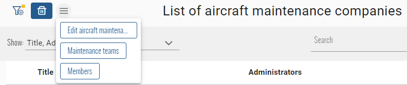
Example :

: the button group component
: container that contains the button group component
: next sibling container of the button group container
If the BiaButtonGroupComponent will automatically group the button under the burger button :
The buttons will return to their intial display format on the same line if mobile mode is not triggered and the space between the
Builtin with CRUD index component
When using a component that inherits from CrudItemsIndexComponent, you can use three predefined array of BiaButtonGroupItem :
selectedButtonGroup: the buttons that must be displayed at the left of the list headerlistButtonGroup: the buttons that must be displayed at the right of the list headercustomButtonGroup: the buttons that must be displayed at the right of the list header title
The definition can be made by overriding the dedicated method of each array :
initSelectedButtonGroup()initListButtonGroup()initCustomButtonGroup()
protected initSelectedButtonGroup() {
  this.selectedButtonGroup = [
    [...] // Define the BiaButtonGroupItems
  ];
}
The CrudItemsIndexComponent will automatically init the button groups at init of the component, after permissions set and when the list element selection changes. It allows you to bind the BiaButtonGroupItem properties to local properties that can change.
If you want to refresh all the buttons groups by yourself, you can call the protected method initButtonGroups() inside your own index component.
You can now use theses arrays with the BiaButtonGroupComponent into your index component for each corresponding pTemplate when using the BiaTableHeaderComponent :
<bia-table-header>
  <ng-template pTemplate="actionOnSelected">
    <bia-button-group [buttons]="selectedButtonGroup"></bia-button-group>
  </ng-template>
  <ng-template pTemplate="actionOnList">
    <bia-button-group [buttons]="listButtonGroup"></bia-button-group>
  </ng-template>
  <ng-template pTemplate="customControl">
    <bia-button-group [buttons]="customButtonGroup"></bia-button-group>
  </ng-template>
</bia-table-header>